Case study 04 · Mobile app · 2020–2021
Sphero EDU Jr
A companion app for Sphero indi, the screen-free coding robot for young learners — designed so kids play and learn with the robot first, and the screen supports the play.
- Role
- Lead UX/UI Designer
- Timeline
- 11/2020 – 05/2021
- Team
- PM & software engineering · Sole designer
- Scope
- Wireframes · Prototypes · Style guide · UI · Unity UI & animation
01 — Overview
Coding play for the youngest learners.
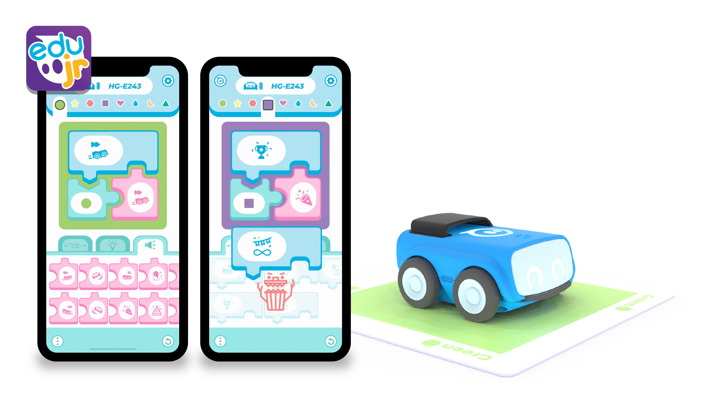
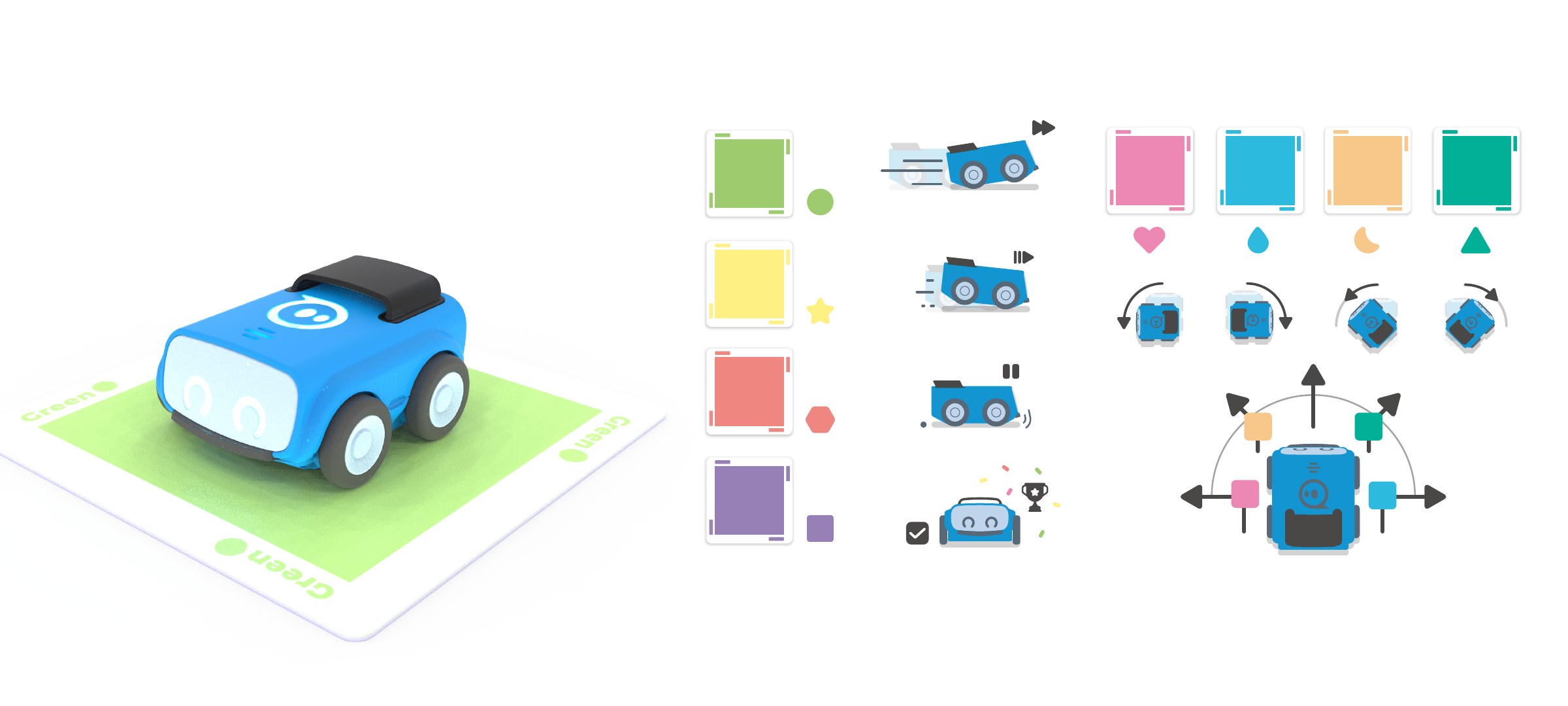
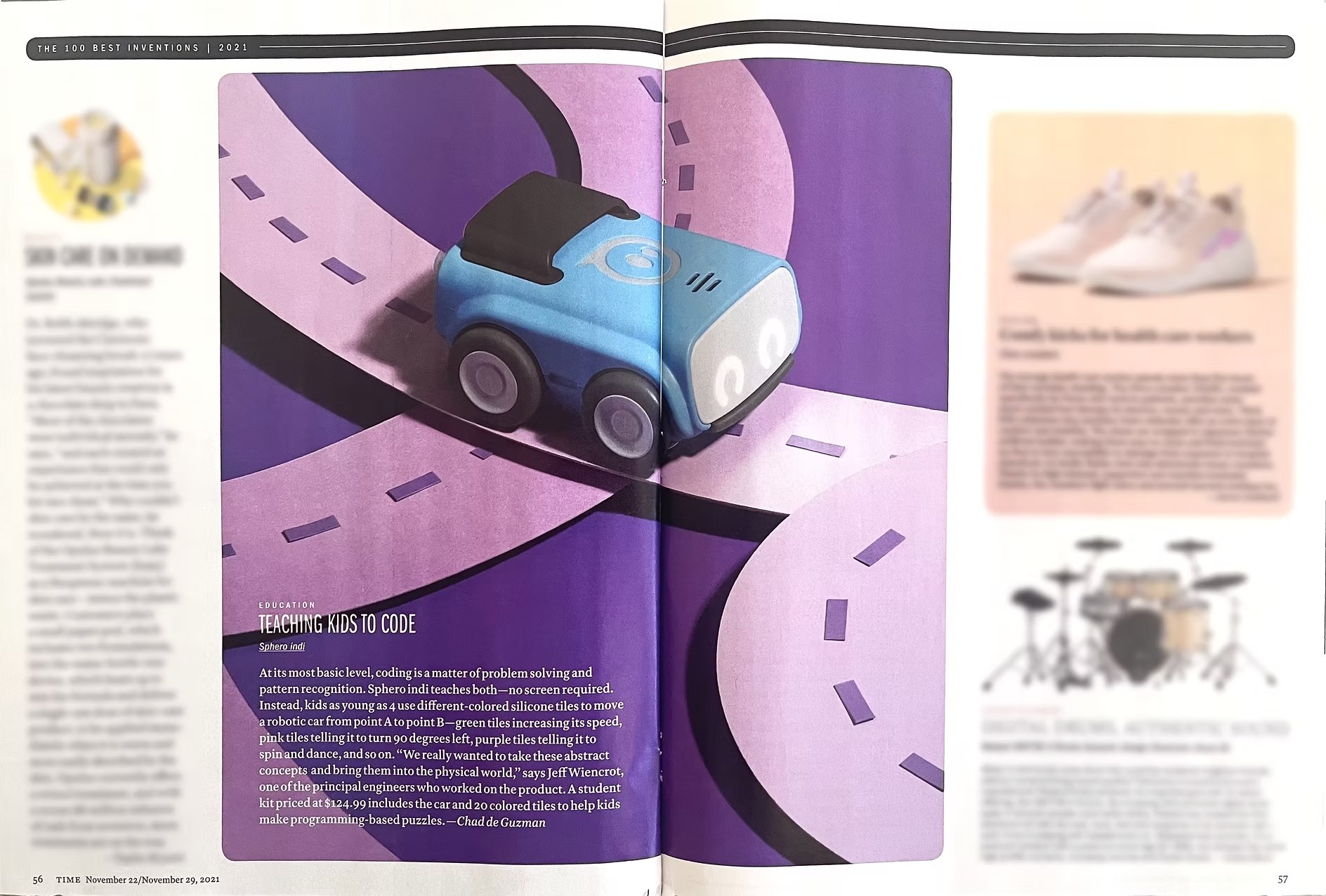
Sphero indi teaches young kids computational thinking without a screen: they lay out color cards, and indi drives over them and follows the instructions. Each card has a default behavior; in Sphero EDU Jr, kids and teachers customize what every color does — the robot’s movement and animation, its LED color and the sound it plays.
As the only designer, working with the PM and software engineers, I translated requirements into a style guide, design system, design patterns and the interface, then created the hi-fi UI assets and implemented them, along with the animations, directly in Unity.
02 — The challenge
Designing an app for kids who can’t read yet.
Sphero indi is made for PreK through 2nd grade, ages 4 and up, so many users can’t read yet. The app had to let them customize each color card’s behavior, LED color and sound without leaning on text — and still work for kids who can’t tell every color apart.
01
Robot first, screen second
The app supports hands-on play with indi instead of replacing it.
02
Minimal text
Icons, color and animation carry the meaning, so pre-readers can use it on their own.
03
Readable without color
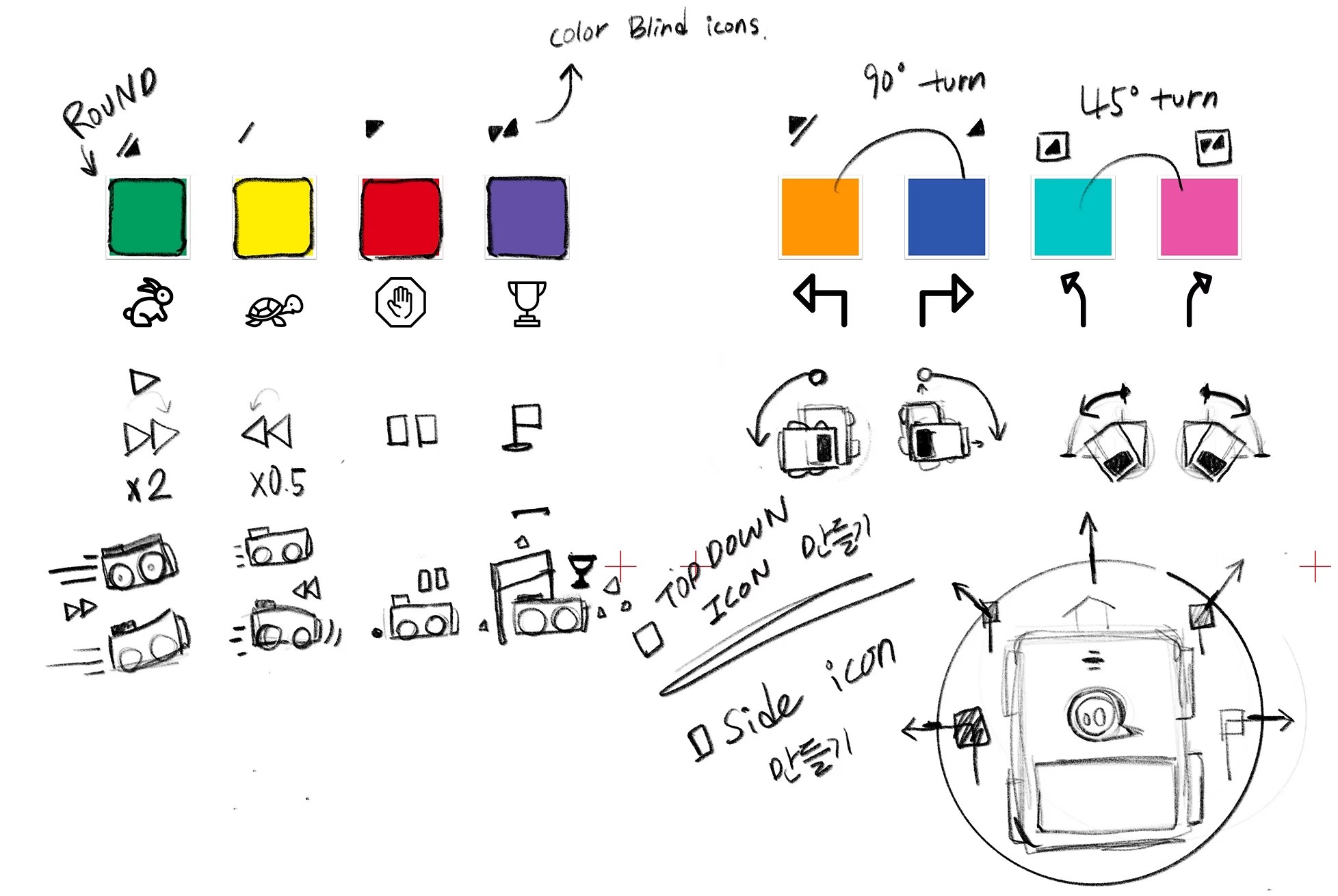
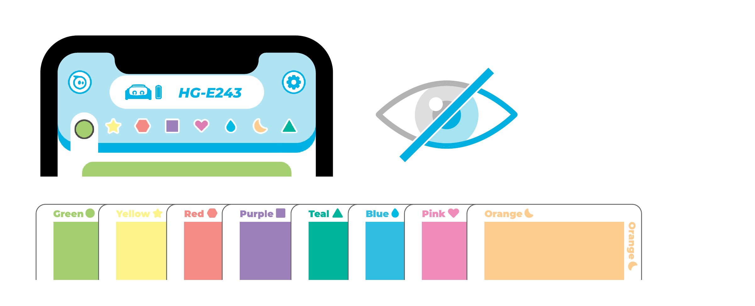
Every color card also has its own shape mark for color-blind kids.
03 — Designing for young kids
Play-based, picture-first
Each color card has a default behavior. In the app, kids pick a card and make it their own: the robot’s movement and animation, its LED color and the sound it plays.
Because the audience is PreK–2nd grade, we kept text to a minimum and let icons, color and animation do the talking. And since color alone doesn’t work for every child, each color also carries its own shape mark for color-blind users.
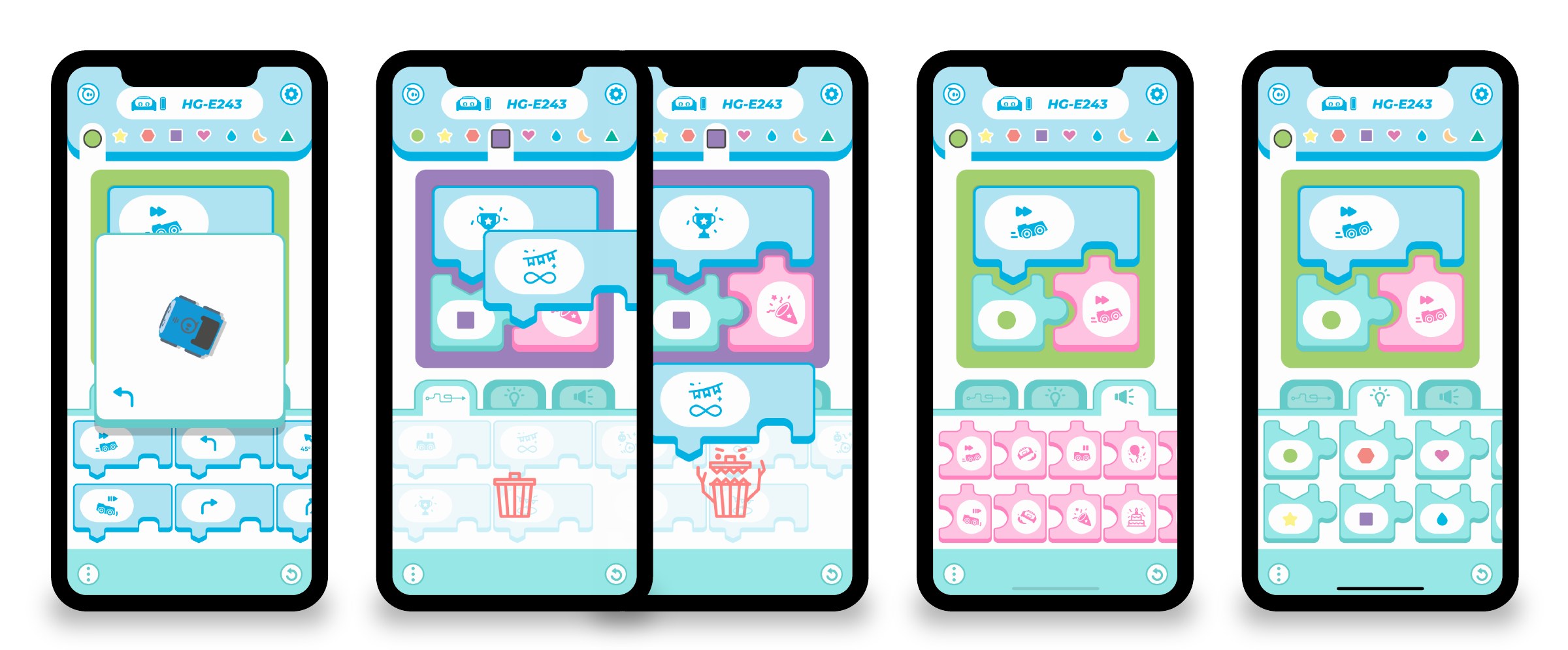
Three principles guided the indi configurator: use a block-based drag-and-drop paradigm kids already know, keep the blocks simple, and lean heavily on icons to reduce the need to read.
First-time experience
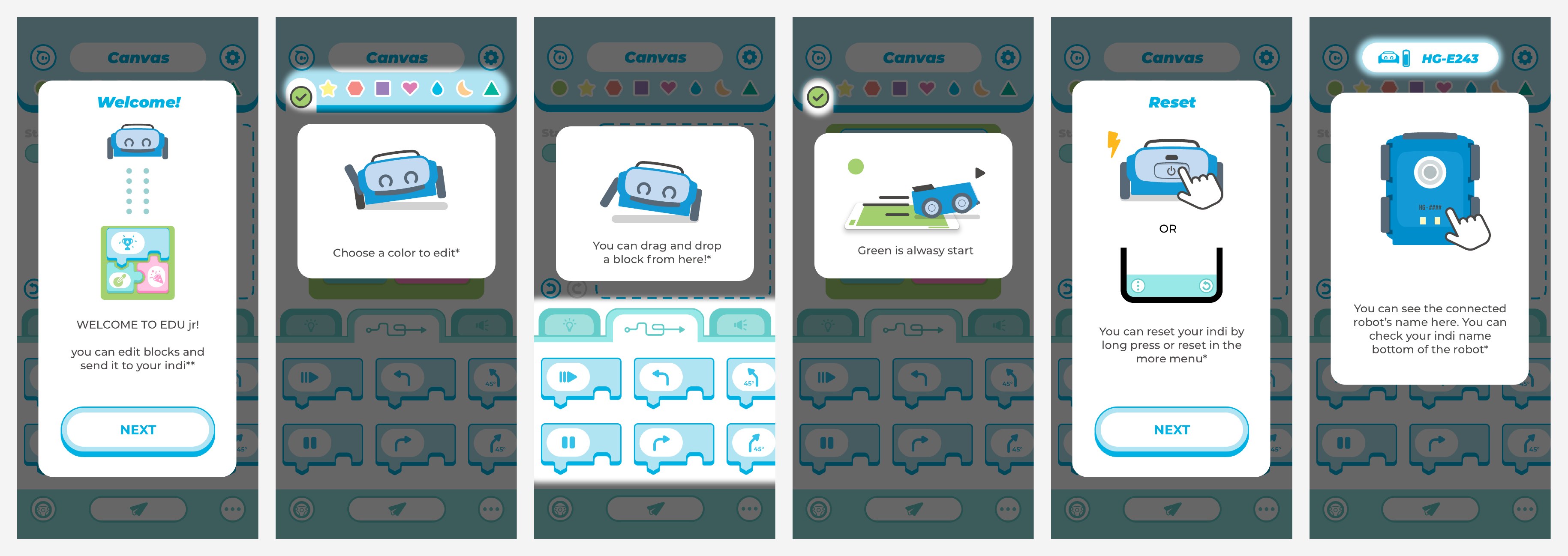
A short walkthrough teaches the app in six picture-led steps: welcome, choose a color to edit, drag and drop a block, green is always start, how to reset indi, and where to find the connected robot’s name.
04 — Style guide & Unity
From style guide to engine
I set the visual language in a style guide and design system, then built the hi-fi UI assets and animations and implemented them in Unity myself, so what shipped matched the design.
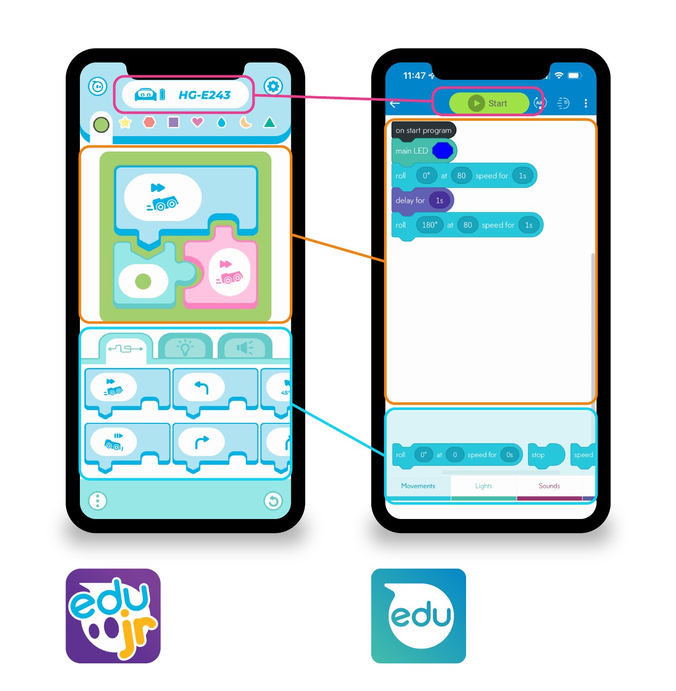
EDU Jr shares its structure with Sphero EDU — a block coding canvas, a shelf of block components and a button to send the program to the robot — so the step up to Sphero EDU feels familiar. The style guide covered color, type, illustration and components.
05 — Outcome
Press
TIME
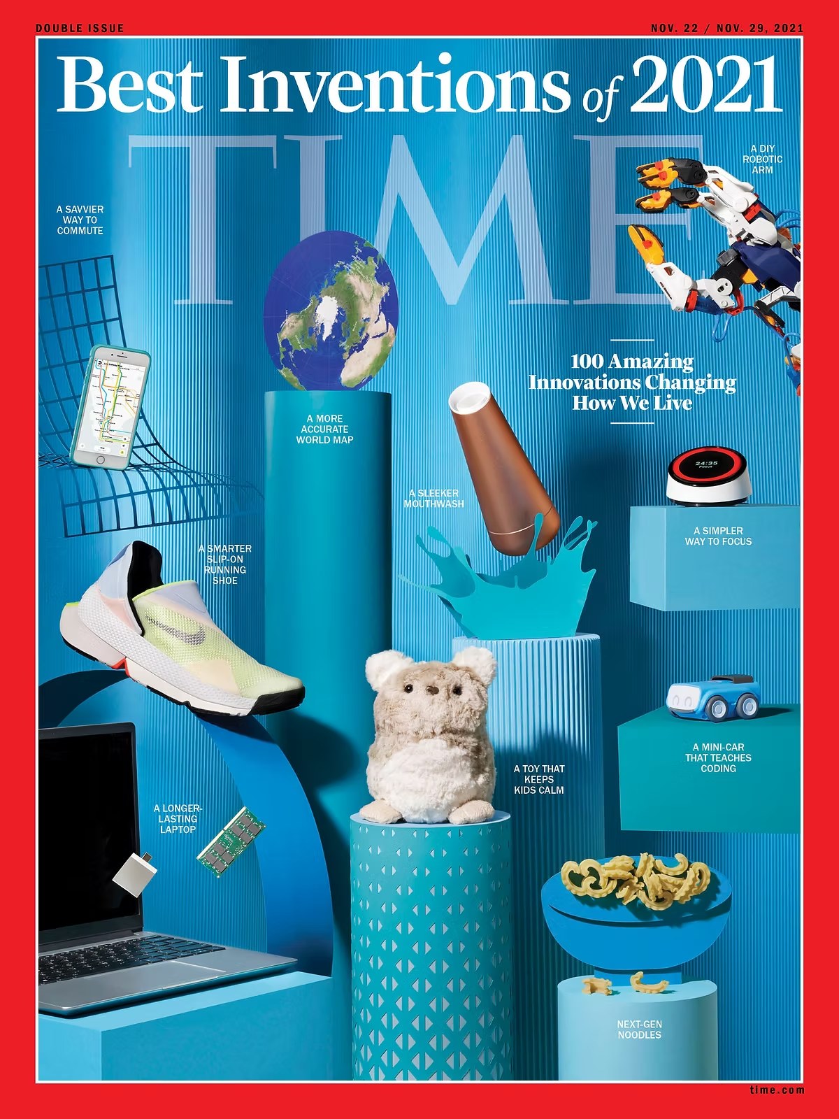
Sphero indi named one of TIME’s 100 Best Inventions of 2021.
Custom icons
35
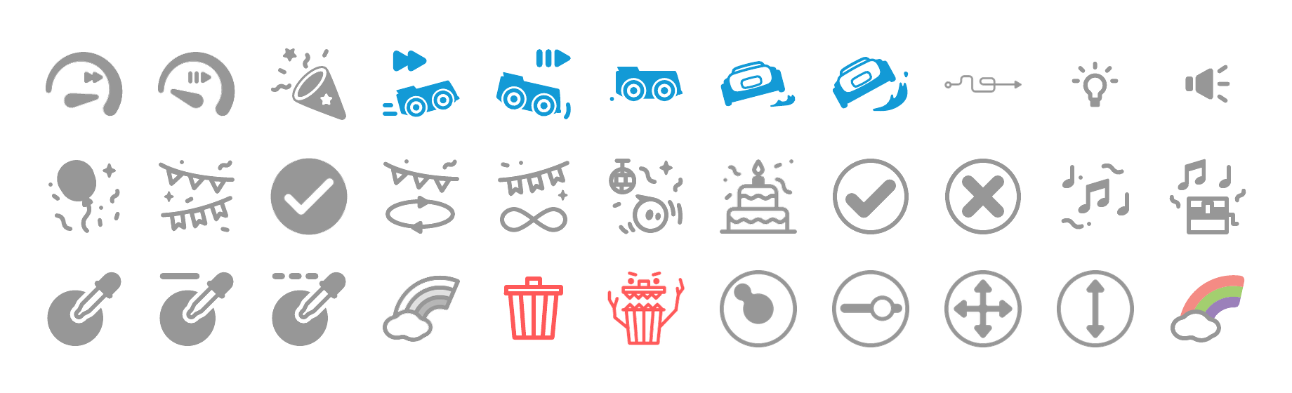
Drawn so pre-readers can understand every behavior, light and sound.
Audience
PreK–2
Ages 4+, with minimal text and a shape mark for every color.
What I learned
- 01
Designing for pre-readers
Taking text away made me rethink how every screen communicates. Icons, color, motion and sound had to carry the meaning on their own.
- 02
Accessibility from the start
Adding a shape for every color made the cards clearer for every kid, not just color-blind ones.